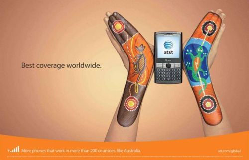
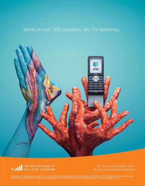
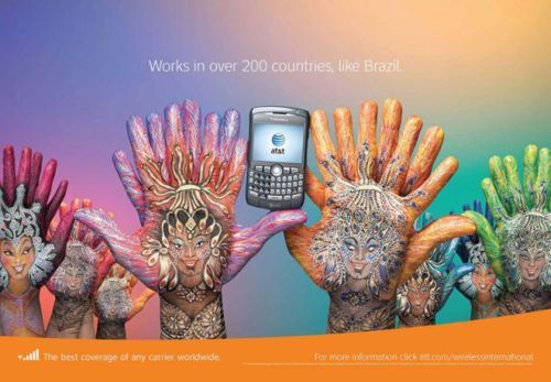
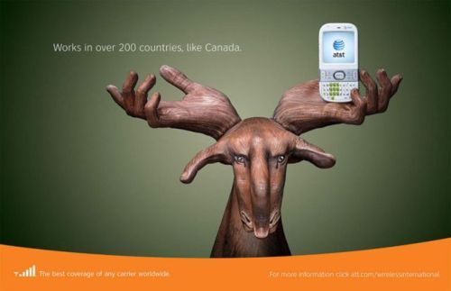
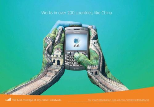
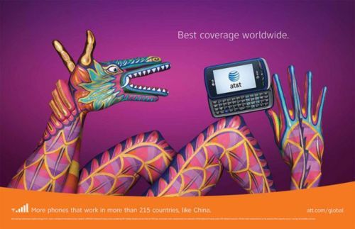
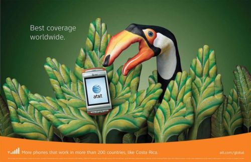
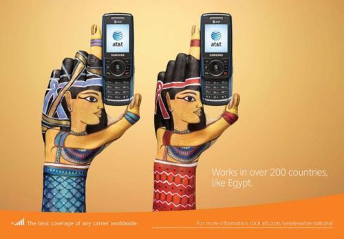
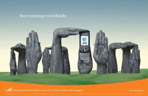
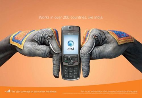
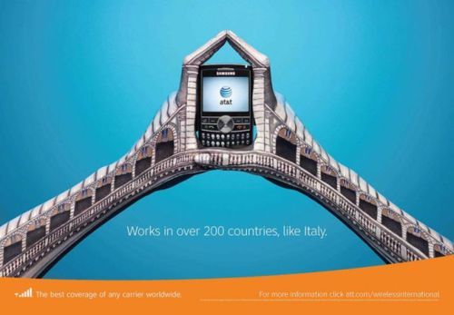
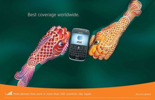
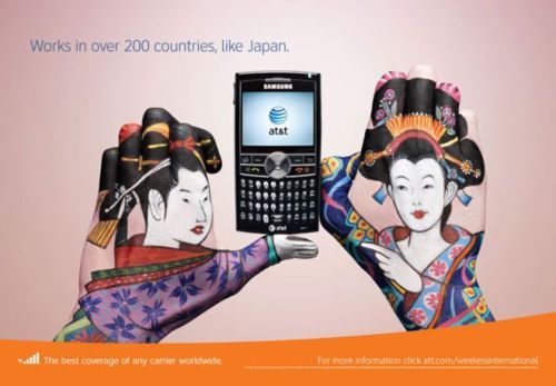
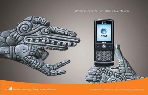
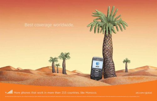
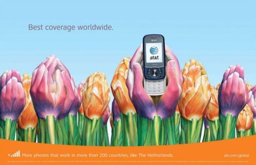
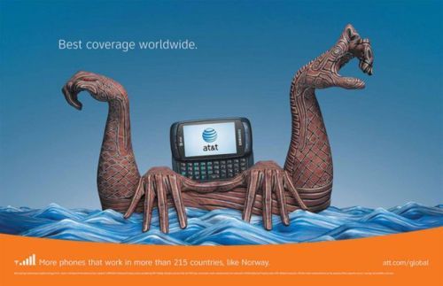
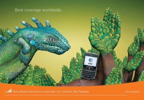
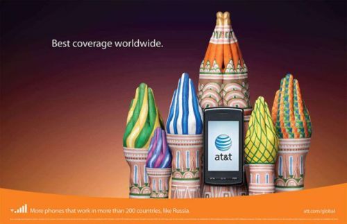
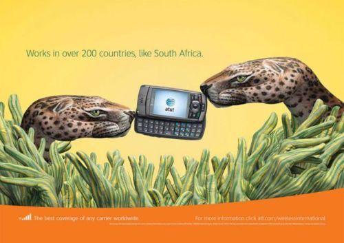
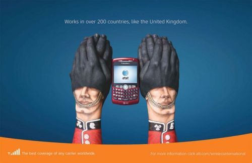
This is an AT&T advertising campaign that was designed by Jose Estrada, a Mexican, who won a million dollars in an open competition organized by AT&T just using painted hands and a mobile phone. Quite amazing!!! Enjoy it!
Australia
Bahamas
Brazil
Canada
China
Costa Rica
Egypt
England
France
India
Italy
Japan
Mexico
Morocco
Netherlands
Norway
Paraguay
Russia
South Africa
United Kingdom
It is pretty amazing how just a few pairs of hands can form so many different background designs, don't you think? They manipulated their hands to form different shapes, did some layering and painted their hands. At first sight, it looks complicated and makes you go WOW. But when you take a closer look, you really have to commend on how creative this idea is, to create something so cool from something so simple and unexpected like your own hands.
I like how AT&T made use of hands to show the concept on how convenient it will be always having an AT&T handphone around with you. They also used the the hands to create different backgrounds to suit different countries and their cultural background and painted them in bright colours to attract attention because we must not forget this is for publicity!
All and all, I really like the innovative aspect of this project as it is something new and something I would never thought could be make me go WOW.


This comment has been removed by the author.
ReplyDeleteHi Chuang! :)
ReplyDeleteWhen I first saw this I was really very impressed! :D I think this is a really interesting way of advertising, one of the more creative ones I've seen especially for a handphone advertisement! :) I especially like the one with jalapenos for Mexico and the Paraguay one because I think theyre very creative and less predictable than some of the others! :) And this definitely captures the attention of the viewer, which would help to promote the product more effectively to a wider audience! I think advertisements should try to appeal more to the audience's visual senses because that is the first way we are exposed to the advertisement and where our first reaction will be from :)
Even though hand painting like this e.g. the cheetah one has been done before by others, I still think this is a really creative and very interesting work of art! :D We should do something like that next time for art! :D`