Sunday, June 5, 2011

HANDphone coverage

I found this on my sister's tumblr :D


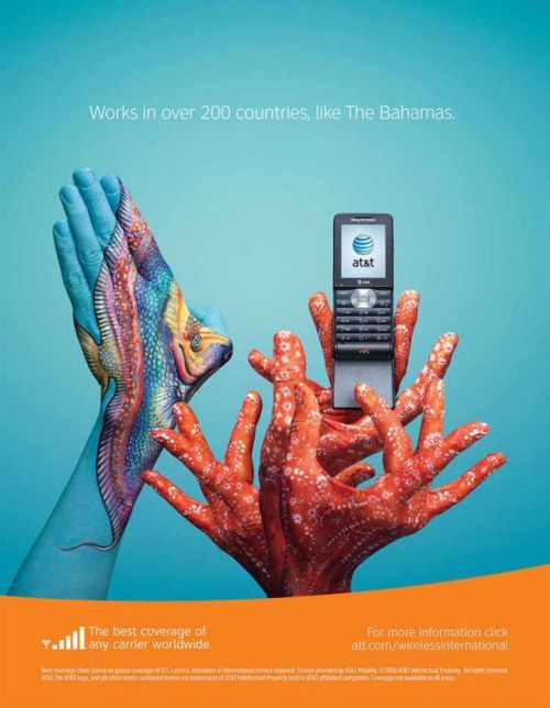
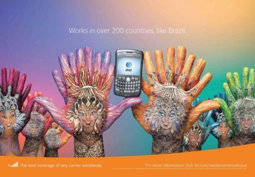
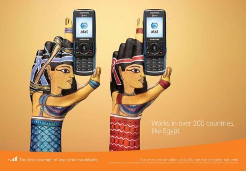
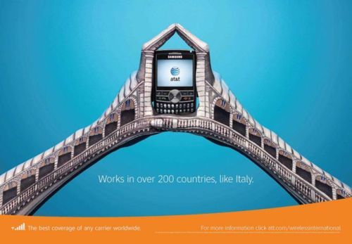
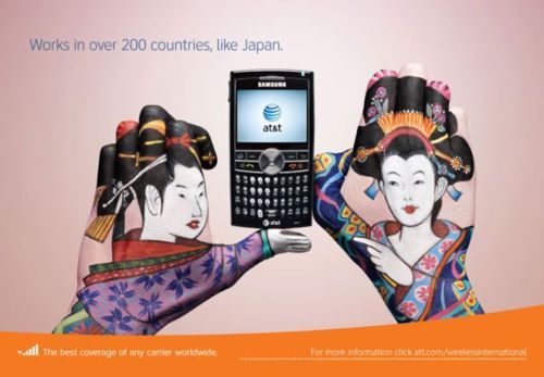
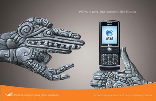
This is an AT&T advertising campaign that was designed by Jose Estrada, a Mexican, who won a million dollars in an open competition organized by AT&T just using painted hands and a mobile phone. Quite amazing!!! Enjoy it!


Australia
Bahamas
Brazil
Canada
China

Costa Rica
Egypt
England
France
India
Italy
Japan

Mexico

Morocco
Netherlands
Norway
Paraguay
Russia
South Africa
United Kingdom


It is pretty amazing how just a few pairs of hands can form so many different background designs, don't you think? They manipulated their hands to form different shapes, did some layering and painted their hands. At first sight, it looks complicated and makes you go WOW. But when you take a closer look, you really have to commend on how creative this idea is, to create something so cool from something so simple and unexpected like your own hands.


I like how AT&T made use of hands to show the concept on how convenient it will be always having an AT&T handphone around with you. They also used the the hands to create different backgrounds to suit different countries and their cultural background and painted them in bright colours to attract attention because we must not forget this is for publicity!


All and all, I really like the innovative aspect of this project as it is something new and something I would never thought could be make me go WOW.

Sunday, May 8, 2011

National Identity = Art??

With globalization, it is futile for Singapore to persist in establishing a national identity in art.


Unfortunately, I have to say that even though establishing a national identity with art is not impossible or useless, but it would be an incredibly difficult feat to accomplish.

Globalization is said to be the age of cultural crisis and has created a homogeneous culture which is heavily westernized, therefore resulting in crisis in the cultural arenas and has slowly destroyed what cultural identity is. Singapore is not excluded, especially with our already weak cultural background. Singapore, as a multiracial society, does not even have a strong cultural foundation to begin with, due to the mixture of religion and tradition brought to Singapore by immigrants from the past. We do not have a unique Singaporean culture as of now, just a mixture of cultures blending together. It still confuses me until now what exactly it means by "Singaporean".

Singapore art is not any different. We do not have a unique style of art that represents Singapore. Instead, all we have now is a confusing mixture of both Western art influences and Eastern art influences, which is essence is just "Nanyang Art". However, as much as we would like "Nanyang Art" to be "Singaporean Art", it just fails to encompass the "Singaporean Spirit" and instead represents the entire South-east Asia. In Indonesia, art can be used to establish national identity among the locals as their art style encompasses their traditions, religion and culture, painting the daily life of their people and the Indonesian society. The Indonesian painters have created their own Indonesian art style over a long period of time. On the other hand, Singapore does not have a cultural heritage development and history long enough, as compared to countries like Japan, who has a strong sense of national identity which can be seen in the Japanese artworks. Therefore, it is incredibly difficult to create and develop our very own local art style that would aid in establishing national identity among our people by acknowledging “Singaporean art”, and not just deeming paintings and sculptures done by local artists as just “art”.

To be truthful, Singaporeans are not really interested in developing art in Singapore, especially Visual Arts, thus using art to try to establish a form of national identity in Singapore is very difficult, in fact, almost impossible. How many people are actually interested in pausing their busy schedule to take a look at the public art around them or take time off to attend art galleries to appreciate what Singaporean artists have accomplished? In fact, they are probably much more interested in flying off to Paris to just take a glance at the famous and renowned "Mona Lisa". Singaporeans mostly thinks that local art is not worth investing time and money on as local art is simply not "famous" and "popular" enough. They rather handle the immense amount of work piled up on their work desk than even sneak a peek at a painting done by a local artist. To try to establish a unique identity with Singaporeans attitude towards local art will indeed take immense amount of work and time to cultivate their cultural interests towards Singaporean art.

Establishing a national identity in art means that WE have to ACKNOWLEDGE that local art is SINGAPOREAN art and not just art or a decorative piece of work. We have to understand that every work that a local artist makes is part of our cultural heritage and we have to accept and be proud of SINGAPOREAN art and its importance to our country. To allow it to be a part of our national identity, we have to make it an important part of US in our lives. Until that happens, art is still unable to make its way into our history.

Therefore, establishing a national identity in art with globalization is not futile but it would extremely difficult and strenuous, and it would take a very long time to make Singaporeans acknowledge Singaporean Art. But still, it should be something we should try and put some effort in as this concerns us and our country’s future.

Monday, April 18, 2011

THE SCREAM!!! :O


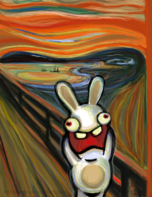
The original "The Scream" by Edvard Munch
It has been widely interpreted as representing the universal anxiety of modern man.

NOW THE MODERN VERSIONS OF "THE SCREAM":


It is quite cool how artists can manipulate the idea of "universal anxiety of modern man" to fit characters like the Raving Rabbits and The Simpsons. I find it quite comical and hilarious that artists can replace the man in "The Scream" with cartoon characters that are rather "anxious" and crazy like the Raving Rabbits. This fully shows the contrast between the past and present idea of "anxiety" and how people are represented. 

Though it may seem as though it is just for fun and laughter, I find that this artworks actually shows how much people have changed over time, and technology and multimedia has changed us to always "think about TV and movies and cartoons" in a way that would never happen in the past. I like how the artworks, being compared to the original "The Scream", shows the contrasts between the people in the past and present and how they can also appeal to the younger generation using cartoons and make art seem fun and enjoyable. I think art has to adapt to different times or younger generations might not be able to accept or enjoy them as others did in the past.


Monday, April 11, 2011

COOL STUFFINGS :D

I took these from my sister's tumblr :D CREDITS!


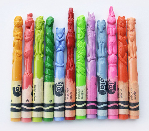
The 12 zodiacs carved out of CRAYOLA :D The carvings are so detailed and amazing. And I think they are trying to carve out the 12 zodiac animals! i like the bright colours and amazing carving technique that made this work seem delicate and attractive.


DESIGNS OF THE FUTURE :

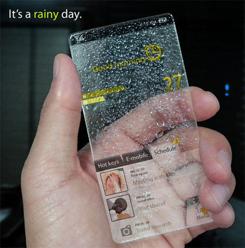
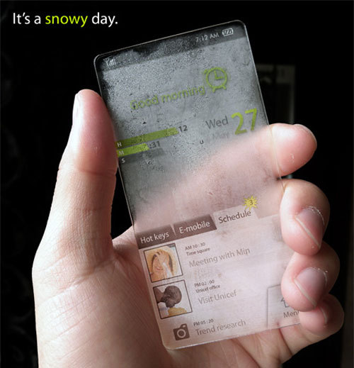
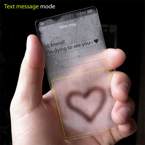
Windows Phone Concept C:


Bio Robot Refrigerator C:


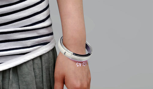
Bracelet Phone C:


E-Roll C:


Newspaper of the Future C:


QWERTY Keyboard for IPhone C:


Folding-Out Laptop C:


HP Lim Glass Computer C:


How COOL is that?! Designs of the future... I just hope they are actually PRODUCEABLE (if that is a word) I find designs of the future interesting because you never know what it would be like in the future and it always sparks my interest! Also, it is exciting to know how design is going to develop to suit our future needs, etc. In a way, this is almost like the evolution of designing and it is quite amazing to see.

I want to create a fridge that can plan your daily meals according to the food in your fridge/occasion/diet/etc :D It would promote healthy eating and could also help you save money by making sure you don't buy food you already have. You could probably scan in what food you have bought and what you have taken out so that the fridge can somehow do the calculations for you and be your own personal nutritionist! Then again, nutritionists would be out of jobs. So maybe not...

Saturday, April 9, 2011

Female Warrior: SRIKANDI

Just about 2 weeks ago, my AEP teacher assigned us an essay writing homework on "Srikandi", by Lucia Hartini. I flipped through all my notes and did some research before I was able to complete this assignment. I HOPE I DID WELL :D


Q1a. Describe the use of space, colour and brushwork.
Lucia Hartini’s painting of Srikandi (1993) depicts a life-size figure with near perfect likeness to herself. This authoritative, challenging and strong figure takes up most of the painting’s foreground, making her the main focus of the painting. The female figure is said to be a strong and powerful female knight character of the Javanese shadow theatre, Srikandi, painted with her fists clenched and muscled hands akimbo, her head up with confidence and wide-open staring eyes, a challenging gesture against the spying eyes before her. The female figure is draped in a long flowing blue cloth, which flows to the painting’s background, causing the viewer’s eyes to move along with it.

The walls next to her zigzags into the distance, creating a good use of space and depth. The cracking walls represents her previous confusion and fear. This contrasts greatly with the firm stance of the female figure. The tertiary coloured walls also provide a strong contrast with the deep blue of the draping cloth, bringing out the vibrancy of the blue hues. This emphasizes on the cool colour, representing the cool attitude and clear mind of the female figure. Lucia Hartini also played around with the texture of the walls and the draping cloth, allowing them to bring out the other. The hard, defined and flat brown brick walls are painted next to the flowing and fluid blue drapery to bring out the contrast rather vividly. Also, the proportion of the figure as compared to the walls is unrealistic, proving that the composition is entirely out of the artist’s imagination. Also, it could symbolize that she is overpowering the fearful feeling she used to have against the society.

In the background, Lucia Hartini depicted a moon-lit sky, which is predominantly blue and yellow in colour. The yellow fills the top of the sky, while dark gloomy clouds surround the bottom. The shadows, produced from the contrast, clearly define the muscles and tan skin of the female figure. The moon rests lightly in the sky, depicting a peaceful and quiet mood in the background as compared to the authoritative and impactful feeling in the foreground. Again, this brings emphasis on the female figure and her superiority against the spying eyes.

All the forms are painted with smooth and well-blended brushstrokes. Each stroke is painted with extra care and every line is defined clearly, showing many details such as the folds of the drapery and the cracks of the brick walls. The shadows and highlights are also painted with care. This created a surrealistic style throughout the painting, even when the figures and forms are painted with great detail and rather realistically. The unnatural and imaginative composition adds to the surrealistic nature of the painting.

Q1b. Comment on the influences behind this work.
Lucia Hartini’s painting of Srikandi (1993) is largely influenced by her own personal experiences and beliefs. One of the strongest influences would be her struggles against the sexism and cultural beliefs in Indonesia. Lucia Hartini is largely affected by the socio-political problems in Indonesia, where the people expects a woman to just do household chores and have children, her status depending on that of her husband, father or male siblings. She is regarded as an obedient subject who is to subject herself patiently to male control and admonition. Also, living in a male dominated society, her social status as one of the few female artists causes people to look at her with a critical eye, deeming her artworks as low quality pieces. Moreover, Lucia Hartini makes a living fully from painting and struggles to make a living to support her family as a single mother. Therefore, she has developed the habit of painting at night after her children go to bed. This might have influenced her painting of the moon in many of her paintings.

Lucia Hartini spent her childhood living, walking around and playing in a natural, quiet and peaceful environment, which is different from the neighborhood she is living now with her children. This result in her longing for a free and peaceful environment, influencing her to depict her imaginings of outer space, planets, sea waves and biomorphic rocks in many of her paintings. She paints these rhythmically in fine lines, using this method as a form of meditation to release the stress she feels from the people around her. She transforms her moods from her daily life into a daydream experience and fantastic new world that is depicted in her paintings, as a form of therapy. Therefore, she paints with vivid colours and great detail, for example the vibrant blue drapery in the painting. This influenced her to paint in a surrealistic style, transporting herself to another world to escape from the Indonesian society.

However, Lucia Hartini strongly believes that sexism comes out of cultural ignorance and refuses to submit herself to the cultural pressure exerted by the society in Indonesia. She thinks that women should represent themselves as autonomous subjects having potential which is different but no less capable than that of their male counterparts. She tries to overcome her difficulties with dealing with the societal stress on her by making her figures to be spirited, bold and assertive in her recent paintings. She also includes symbols in her painting as a response to the society norm. For example, the disembodied eyes in the painting, Srikandi, represents the society’s expectations of her as a woman and their disapproval of her as an artist and the walls cracking represents her triumph over the society norm. She also depicts Srikandi, as seen from the title of the painting, a daring, strong and powerful female knight character of the Javanese shadow theatre. She could have personified herself as Srikandi to symbolize her breakthrough for her personal growth and overcoming her fears and defeat. She repels the critical eyes of the society, which had rendered many woman prisoners of tradition. This can be seen from the confident and strong figure in the paintings staring openly and defiantly at the scrutinizing eyes.

Lucia Hartini’s painting, Srikandi (1993), is strongly influenced by her personal breakthrough in life and the courage she had to overcome the critical opinions of the society she lives in.

So... Here is my essay on "Srikandi" C:

Sunday, April 3, 2011

What is ART?


Here's an interesting and super duper cute video that Mrs Tan showed us during SOVA class! It involves a lot of questions that we should think about when we look at the topic: "WHAT IS ART?"

To me, the VALUE OF ART changes according to personal views and standards. If you think a kindergarten child's piece of work is ART, then that is what ART is to you. But you think that only the artworks shown in museums are considered ART, then so be it. There is no actual definition to ART. What YOU think is ART might not be what I think is ART. But does that matter?

Monday, February 7, 2011

PAINTING WITH MUSIC!

OMG OMG OMG OMG OMG


JUST WATCH THIS! DON'T STOP HALFWAY JUST BECAUSE IT SOUNDS LAME (they keep talking)!


IT IS SUPER-DEE-SOOPER-DEE COOLIO :D


Canon Pixma: Bringing colour to life from Dentsu London on Vimeo.


Dentsu London, the same ad agency that recently experimented with iPad light-painting, was recently hired by Canon to create a commercial for the Canon Pixma line of printers. They decided to create super close-up and super slow-mo shots of paint dancing by using sound, and created a rig that spins around the paint super fast to create a sense of motion as they shoot at 5000 fps. As you’ll see from the video, this is a great idea for still photos as well.
The resulting commercial can be seen at the end of the video. It’s stunning.


(http://www.petapixel.com/2010/10/02/making-paint-dance-in-slow-motion-using-sound-waves/)


This is such an awesome idea for coursework.. but it might be hard D: You probably need a really good sound system and really nimble fingers to capture shots that would be pretty amazing. I like how they can use paint and sound waves to combine two forms of the ARTS, music and visual arts.


I thought about combining 3 forms of the ARTS, dance, music and visual arts because I feel comfortable dancing to the music and using this to create art that could be used for my coursework. But then, it could be quite complicated and I probably have to use videos to record down me dancing and painting my coursework and I am not very good at playing around with videos. So this idea will mostly likely be in the back of my head.